This first one is for my soon to be mother-in-law. This was the first time I used my cupcake stamps. I coloured the three images with copics. In the second picture I tried to capture the shine on the strip of paper in the middle. I like making certain parts of the card pop up so I used foam squares to secure the cupcakes to the card; I was then able to overlap the big ones so it looks like one is in front of the other. The sentiment and other little stamps are from the same set as the cupcakes.
June 11, 2011
Happy Birthday
We were heading to a BBQ to celebrate all the birthdays in the family for May so I spent the morning making a few cards.
This first one is for my soon to be mother-in-law. This was the first time I used my cupcake stamps. I coloured the three images with copics. In the second picture I tried to capture the shine on the strip of paper in the middle. I like making certain parts of the card pop up so I used foam squares to secure the cupcakes to the card; I was then able to overlap the big ones so it looks like one is in front of the other. The sentiment and other little stamps are from the same set as the cupcakes.
May 23, 2011
Simple Cards
I love colouring stamped images with copics but often when I'm done I'm at a loss for how to put it into a card. I convinced myself that not all cards have to be busy or complicated so I tried a few simple cards.
I started with plain white cards and embossed each with a cuttlebug folder. I found a stamp and coloured it seperately then added it to the card with foam squares so it pops up a bit.
| Click to view larger |
For this card I added milled lavender distress ink to the embossed card. I used the same colour ink on the edges of the cut out stamp image to make it stand out a bit more. The stamped image was also heat embossed with black powder.
| Click to view larger |
On the second card I lightly went over the embossed dots with broken china distress ink, then went back with two copic markers to darken random dots. The distress ink was also used around the stamped image.
Labels:
cards,
copics,
cuttlebug,
distress inks,
embossing,
heat embossing,
simple
May 19, 2011
Impressabilities!
I love trying new things and I have been learning so much about paper crafting. I just looked back at my first blog entries and I have come so far! I almost wanted to remove posts of some of my first attempts but I didnt.
I recently bought a couple Spellbinders Impressabilities! On this recent card I used the Flower Silhouette on patterned paper. I lightly went over the embossed area with peeled paint distress ink to help the flowers pop.
I also got a MS butterfly punch. I punched one piece of purple paper, then punched some clear plastic. (I keep scraps from food and craft packaging like plastic and cardboard to use later) For the plastic butterfly I used a straight edge to help bend each wing up from the body, keeping the body flat to sit on the card. On the plastic I also ran a few lines of glue and poured glitter over. I then ran another bit of glue down the underside of the body on the plastic butterfly and adhered it to the paper one.
The girl is Queens Cutie from KennyKDownloads. Check out the site.. not only are the images great and affordable, there is a freebie each month!
The tree stump is from Whiff of Joy.
I recently bought a couple Spellbinders Impressabilities! On this recent card I used the Flower Silhouette on patterned paper. I lightly went over the embossed area with peeled paint distress ink to help the flowers pop.
I also got a MS butterfly punch. I punched one piece of purple paper, then punched some clear plastic. (I keep scraps from food and craft packaging like plastic and cardboard to use later) For the plastic butterfly I used a straight edge to help bend each wing up from the body, keeping the body flat to sit on the card. On the plastic I also ran a few lines of glue and poured glitter over. I then ran another bit of glue down the underside of the body on the plastic butterfly and adhered it to the paper one.
The girl is Queens Cutie from KennyKDownloads. Check out the site.. not only are the images great and affordable, there is a freebie each month!
The tree stump is from Whiff of Joy.
| Click to view larger |
Labels:
copics,
digi stamp,
distress inks,
easel card,
embossing,
paper punch
May 16, 2011
Trying new things...
For this card I tried a couple new techniques to me.
On the cuttlebug folder I added antique linen distress ink to the back side. This gave the background colour, not the embossed dots. I used two copic markers to add random dots.
The stamped image was heat embossed with white powder which is also new for me. I went in with fine tip pens to add colour to the negative space in the image.
The background on the flower piece has distress ink in antique linen with some faded jeans around the edge. The scalloped circle also has faded jeans with some dots added with a white gel pen.
I dont have a lot of dies so I just cut a circle and went around it with my scallop scissors. Worked out pretty well I think.
On the cuttlebug folder I added antique linen distress ink to the back side. This gave the background colour, not the embossed dots. I used two copic markers to add random dots.
The stamped image was heat embossed with white powder which is also new for me. I went in with fine tip pens to add colour to the negative space in the image.
The background on the flower piece has distress ink in antique linen with some faded jeans around the edge. The scalloped circle also has faded jeans with some dots added with a white gel pen.
I dont have a lot of dies so I just cut a circle and went around it with my scallop scissors. Worked out pretty well I think.
| Click to view larger |
May 9, 2011
Water Detail Card
I thought I would show another card using a stamp by Ching-Chou Kuik since I love them so much. This one is called Autumn Falls. Coloured with copics and white gel pen for white of eyes.
For the card base I used a cuttlebug folder to emboss the front. The card is actually bigger than the folder I used so I ran it through twice to cover the whole front. You can see the line a bit where the folder end met with the second embossing pass but I put the image over it and its not really noticeable.
I used Distress Inks to add some interest to the embossed card. If you go over the area lightly you will only add colour to the raised parts. I also didnt cover the entire thing, making some areas darker felt more like water to me.
For the card base I used a cuttlebug folder to emboss the front. The card is actually bigger than the folder I used so I ran it through twice to cover the whole front. You can see the line a bit where the folder end met with the second embossing pass but I put the image over it and its not really noticeable.
I used Distress Inks to add some interest to the embossed card. If you go over the area lightly you will only add colour to the raised parts. I also didnt cover the entire thing, making some areas darker felt more like water to me.
| Click to view larger |
May 5, 2011
Wow.. its been five months. Although I havent posted in a long time, I have been crafting. I thought it was about time I took some pictures and updated the blog!
I wanted to play around with the Tim Holtz Distress Inks for this one.
I had a plain white card and randomly added colour. I used a cuttlebug embossing folder to create the frame and cut out the oval. Again I used Distress Inks on the frame to add depth, darkening the raised swirl part. On the frame around the image I added some faux stitching with a white gel pen.
Last but not least is the image! I love the stamps over at Sweet Pea Stamps. They always have sales and the regular prices are great as is. They have many wonderful artists who make beautiful images.
This stamp is called Come Softly by one of my favorite artists over there, Ching-Chou Kuik. The image was coloured with copic's.
When colouring images I always like to go back when it is finished and use the white gel pen to add the nice crisp white back into the eyes. Sometimes the ink bleeds or I work too fast and by accident get colour in that area. I like the sharp contrast in the eyes : )
I wanted to play around with the Tim Holtz Distress Inks for this one.
I had a plain white card and randomly added colour. I used a cuttlebug embossing folder to create the frame and cut out the oval. Again I used Distress Inks on the frame to add depth, darkening the raised swirl part. On the frame around the image I added some faux stitching with a white gel pen.
Last but not least is the image! I love the stamps over at Sweet Pea Stamps. They always have sales and the regular prices are great as is. They have many wonderful artists who make beautiful images.
This stamp is called Come Softly by one of my favorite artists over there, Ching-Chou Kuik. The image was coloured with copic's.
When colouring images I always like to go back when it is finished and use the white gel pen to add the nice crisp white back into the eyes. Sometimes the ink bleeds or I work too fast and by accident get colour in that area. I like the sharp contrast in the eyes : )
| Click to view larger |
Labels:
card,
copics,
cuttlebug,
distress inks,
embossing,
sweet pea stamps,
white gel pen
December 27, 2010
Last Christmas Card
I can't stop my obsession! I bought myself a cuttlebug and several embossing folders. The worst part (or the best!) is the $50 gift card to Michaels and $100 to spend on crafty stuff that I got for Christmas. In other words my obsession is being fueled by family and friends so I dont see it ending any time soon : )
Anyways, I ran out of time to post everything before Christmas so here is my last and one of my favorite cards for the holidays.
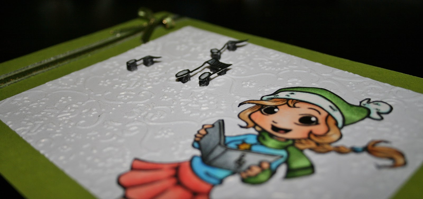
For this card I used some shimmery white paper and embossed it! Oh its fun, I wanted to just emboss paper all night when I got the cuttlebug home, hehe. The girl is from Whiff of Joy Stamps and coloured with copics. I cut out the music notes and popped them up with foam squares.
I layered the green ribbon on top of the silver one then added a bow made with the bow easy. Check out the video. I never used to add bows but this makes it so easy and they always look perfect!
Anyways, I ran out of time to post everything before Christmas so here is my last and one of my favorite cards for the holidays.
For this card I used some shimmery white paper and embossed it! Oh its fun, I wanted to just emboss paper all night when I got the cuttlebug home, hehe. The girl is from Whiff of Joy Stamps and coloured with copics. I cut out the music notes and popped them up with foam squares.
I layered the green ribbon on top of the silver one then added a bow made with the bow easy. Check out the video. I never used to add bows but this makes it so easy and they always look perfect!
December 22, 2010
I've seen easel cards all over and wanted to try it out myself. I used a small snowflake stamp on the background and embossed it. The green ribbon is an old sticker I had and I coloured it with a copic marker to match the image, which is also coloured with copics. Then I added a few pearls.
I followed the directions for the card from a youtube video for the dimensions.
The only problem I had was finding an envelope to fit the small square shape. Cricut to the rescue! I found a SVG file for an envelope over at Penny Duncan Creations. Take a look around her site, she has so many wonderful files.
I've recently upgraded to Sure Cuts a Lot 2 and love the new features.
December 20, 2010
A break from the holidays
I have been working on Christmas cards for some time now and wanted to take a break and work on something different. I've mentioned in the past using line art from DeviantArt and have found a beautiful image! Komorinight has posted this image and I loved it as soon as I saw it.
| Click to view larger |
-I coloured the image with copics
-used a glitter pen on the flowers
-added dots to the background randomly with copics
-used distress ink around the edges
-added white dots with a gell pen (after distressing or they will not be white)
I added the finished image to a white card where I had also used distress inks.
December 12, 2010
I Won!
For the first time I entered a card into blog challenges. A week or so later I was surprised when I was reading new posts from the blogs I follow and all of a sudden I read my name and saw my card! I won!
This on its own was exciting as I've only recently gotten into blogging and this was the first card I entered for challenges.. so I sent an email to claim my prize and was told as that weeks winner I had the opportunity to be a guest design team member for the following week.
You can check out the post over at Anyone for Anya? About halfway down under this weeks challenge my card shows my take on Shabby Chic Christmas.
This on its own was exciting as I've only recently gotten into blogging and this was the first card I entered for challenges.. so I sent an email to claim my prize and was told as that weeks winner I had the opportunity to be a guest design team member for the following week.
You can check out the post over at Anyone for Anya? About halfway down under this weeks challenge my card shows my take on Shabby Chic Christmas.
I used the shadow box card again, but this time made it larger.
I stamped the word background on blue paper, cut a lace design on the cricut in some shimmer white paper. A few pearls were added to the sides, and of course the image is coloured with copics.
If you would like the lacey cut file head over to The Scrapoholic and you can download it for free!
*Its the third one down called Scrolled Lace Mesh
December 11, 2010
Shadow Box Card
I always like trying new things so I was excited to try making a shadow box card when I saw it. I like to watch videos on youtube when looking for new ideas. Over at Splitcoast Stampers she has so many videos! I got this idea there. I love how she shows you step by step how to make things and provides measurements along the way.
As I'm still working on my Christmas cards I decided to use this new type of card.
The stamp is once again from Whiff of Joy. The Merry Christmas is from a large stamp by Inkadinkado, here. I only wanted the words as the stamp is too big for this project, so I cut out only the words.
The paper is from a small pack from K&Company. It was on sale at Michaels and I love how its double sided so you always have two patterns that coordinate.
Coloured with copics which I have officially fallen in love with!
December 9, 2010
New Stamps!
Over at Bizzy Becs Online Store they are introducing Blue Butterfly Stamps!
You can check out the store blog and see a sample from the Victorian Sweethearts Collection, so cute : )
December 2, 2010
Straying from the holidays
I havent used my cricut for so long. It sits on a shelf above my desk right in front of where I sit when I'm working on something. I look at it almost every day but the laziness in me thinks about hooking it up to the laptop (I use Sure Cuts A Lot) and clearing a spot on the desk for the paper to move freely. Needless to say I dont use the Cricut as often as I should.
The svg cuts the paper to the right size to add to the card, and cuts the flower petals as well as a hole in the center of each flower. I dont remember where I got this svg from. I've searched for free svg's and have a large collection, unfortunately I didnt organize them to remember where I found them.
I used a regular white card as the base and added the purple paper cut from the cricut to the front. The flower petals are cut so you can bend/fold them up to add dimenion. I used a copic marker for the yellow middle, then used sparkle embossing powder on the petals.
The stamp is from Whiff of Joy and I think she is so adorable. She's coloured with copics and I'm really pleased with how she came out. I think I'm starting to get better with shading and blending!
The svg cuts the paper to the right size to add to the card, and cuts the flower petals as well as a hole in the center of each flower. I dont remember where I got this svg from. I've searched for free svg's and have a large collection, unfortunately I didnt organize them to remember where I found them.
I used a regular white card as the base and added the purple paper cut from the cricut to the front. The flower petals are cut so you can bend/fold them up to add dimenion. I used a copic marker for the yellow middle, then used sparkle embossing powder on the petals.
The stamp is from Whiff of Joy and I think she is so adorable. She's coloured with copics and I'm really pleased with how she came out. I think I'm starting to get better with shading and blending!
| Click to view larger |
November 30, 2010
3D Christmas Card
This image is from Stampin' Up and coloured with copics. I like the scene and its somthing different, recently I have been doing images of little girls.
I stamped it twice so I could pop up some of the elements. While looking at the picture and trying to decide what I was going to have pop up I noticed there are so many layers of elements in this scene. I thought about doing the light, the wreath, the skis etc. I finally settled on (with advice from my boyfriend hehe) the tree and sled. The bow is slightly elevated but not as high as the others. The light looked flat so I added crystal effects to help it stand out. I added this to the snow on the tree and the metal part of the sled as well.
The idea for ripping the paper on the side came from the Stampin' Up catalogue.
I stamped it twice so I could pop up some of the elements. While looking at the picture and trying to decide what I was going to have pop up I noticed there are so many layers of elements in this scene. I thought about doing the light, the wreath, the skis etc. I finally settled on (with advice from my boyfriend hehe) the tree and sled. The bow is slightly elevated but not as high as the others. The light looked flat so I added crystal effects to help it stand out. I added this to the snow on the tree and the metal part of the sled as well.
The idea for ripping the paper on the side came from the Stampin' Up catalogue.
| Crystal effects on the light and tree. |
| Crystal effects on the sled metal and stickles on the ornaments. |
November 28, 2010
First Challenge Entry
I see a lot of bloggers participate in challenges and wanted to try it out.
Over at Anyone For Anya they have a sketch challenge and you need to use an image from The Greeting Farm or CC Designs. I just happened to have this cute one coloured and sitting on my desk waiting to be added to a project.

Over at Anyone For Anya they have a sketch challenge and you need to use an image from The Greeting Farm or CC Designs. I just happened to have this cute one coloured and sitting on my desk waiting to be added to a project.
Luckily I coloured her in non-traditional colours so I’m able to enter the card in the challenge over at Mad For Markers as well. Currently their challenge is to make a Christmas card using non-traditional colours.
And lastly Copic Oz has their challenge of "Christmas with a twist." My non-traditional Christmas colours fits with this one too!
This is my first square card and I’m pretty happy with it.
November 24, 2010
Get Well Soon
My boyfriends grandma was sick so I made her a card. The image was one I had in my box of already coloured images. The stamp is from Whiff of Joy Stamps and coloured with copics.
I had just bought this new background stamp from Michaels and was excited to use it. I embossed it with clear powder. I'm still waiting for my distress ink pads to be delivered so I only have two colours of ink right now. I used a blue ink pad to distress the card and make the stamped image stand out a bit more.
If you want some help making the perfect bow, check out the bow easy.
I added some stickles to the white background of the image.
November 21, 2010
Magnets with the Kids
Every few weeks I have my niece and nephew over for the night. They love all the crafty things I have and get so excited when I let them make something. I have a box where I keep all the images I have coloured and havent used yet on a project. I layed them all out on the table and said they could each pick one and make it into a magnet. Using the Xyrom 5" create-a-sticker, we put the image through then stuck them to a thin sheet of magnet. I used my exacto knife to trim around the image and we were done!
My niece picked this cute one from CC Designs. This was pre-copic markers for me so it was done with Prismacolor markers. I painted over the image with mod podge after I coloured it for protection.
My nephew picked another image I coloured pre-copics. This one is also from CC Designs and was also coated with mod podge.
Check out VistaPrint if you havent already. They always offer free products and if you sign up you will receive emails with even more free things! For this project I used some leftovers I had from ordering the free large calendar magnets.
![]() |
| 5" create-a-sticker from Xyron |
November 6, 2010
Christmas card 2
I love this stamp!
Another new technique I've seen is to add glossy accents to the eyes. I like the effect it gives, makes it feel a bit more realistic. First time attempt to use the embossing ink pad to stamp for a subtle bakground. And like the last card, I added some blue from an ink pad to the outside edges. The jewel phrase was a sale item I picked up at Michaels a while ago.
November 5, 2010
Christmas Card
Time to start on the Christmas cards. I again trid some new technques. I used a green ink pad to add some darker colour to the outside edges, and it adds some dimension. I also poped up the larger flower and the leaves under it.
I stamped a second image to add the larger flower. For the laves underneath I cut around them on the bottom later and propped them up with a foam square. I was trying to have it look like a seperate middle layer; not part of the bottom image and not attached to the top flower. I coloured the blank space underneath the leaf so there wasnt a bright white spot visable.
October 28, 2010
Another Birthday Card
My boyfriends grandma just celebrated her 84th birthday and this is the card I made her.
The paper is from a girls pack by Martha Stewart.
The papers are double sided so the paterns go well together.
I used the foam squares to pop up the whole cupcake stamp.
This is a metal embellishment I got in a pack from the dollar store. The words didnt pop like I wanted so I went over the letters with a silver gel pen then took a copic marker to create the muttled colour on the surface. It looks a lot better in person, hard to photograph shiny objects.
I used green ribbon wrapped around the front of the card to attach the words. Instead of cutting the ribbon and gluing it only to the front I wrapped the ribbon inside and tied it to secure everything.
The cupcakes looked flat so I heat embossed the tops with a clear sparkle powder.
The cupcake digi stamp is from Squiggle Fly.
Labels:
birthday,
card,
copics,
digi stamp,
heat embossing
Subscribe to:
Posts (Atom)